Design Scope
Creation of a comprehensive brand book defining how the EJAF identity is applied across all global communications.
Approach
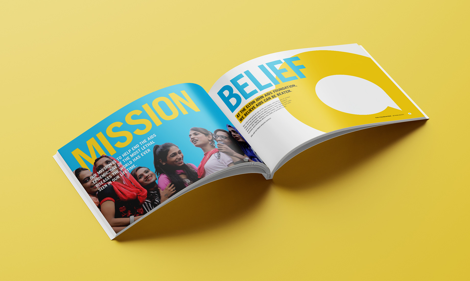
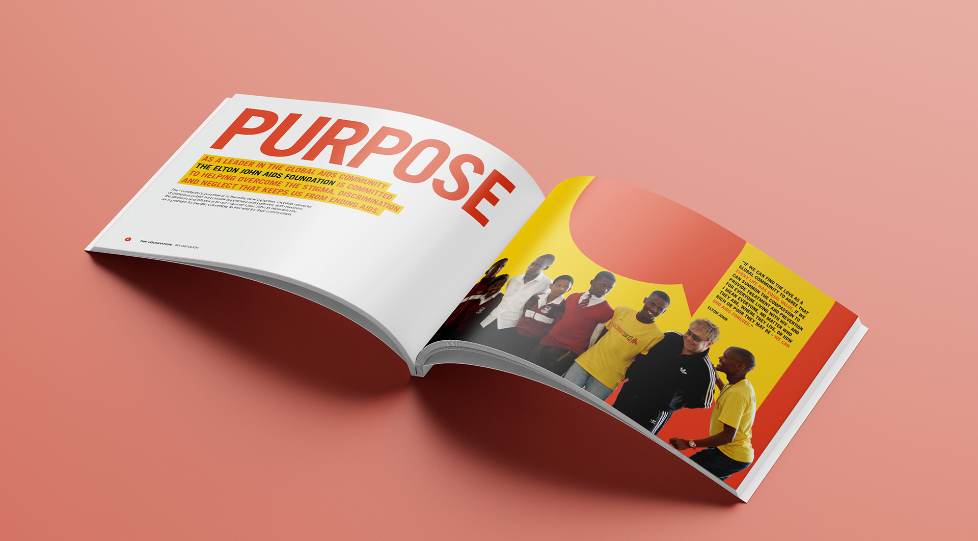
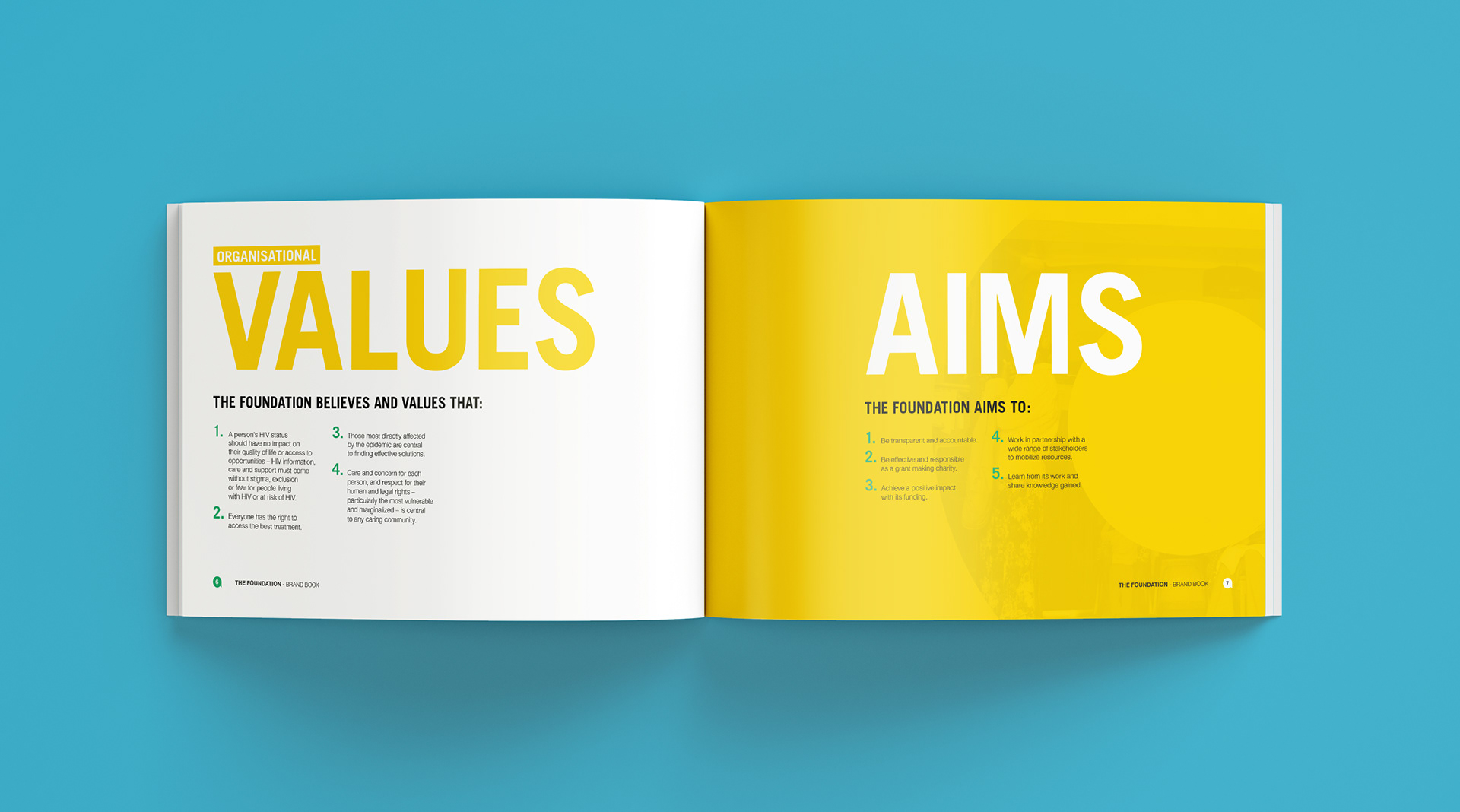
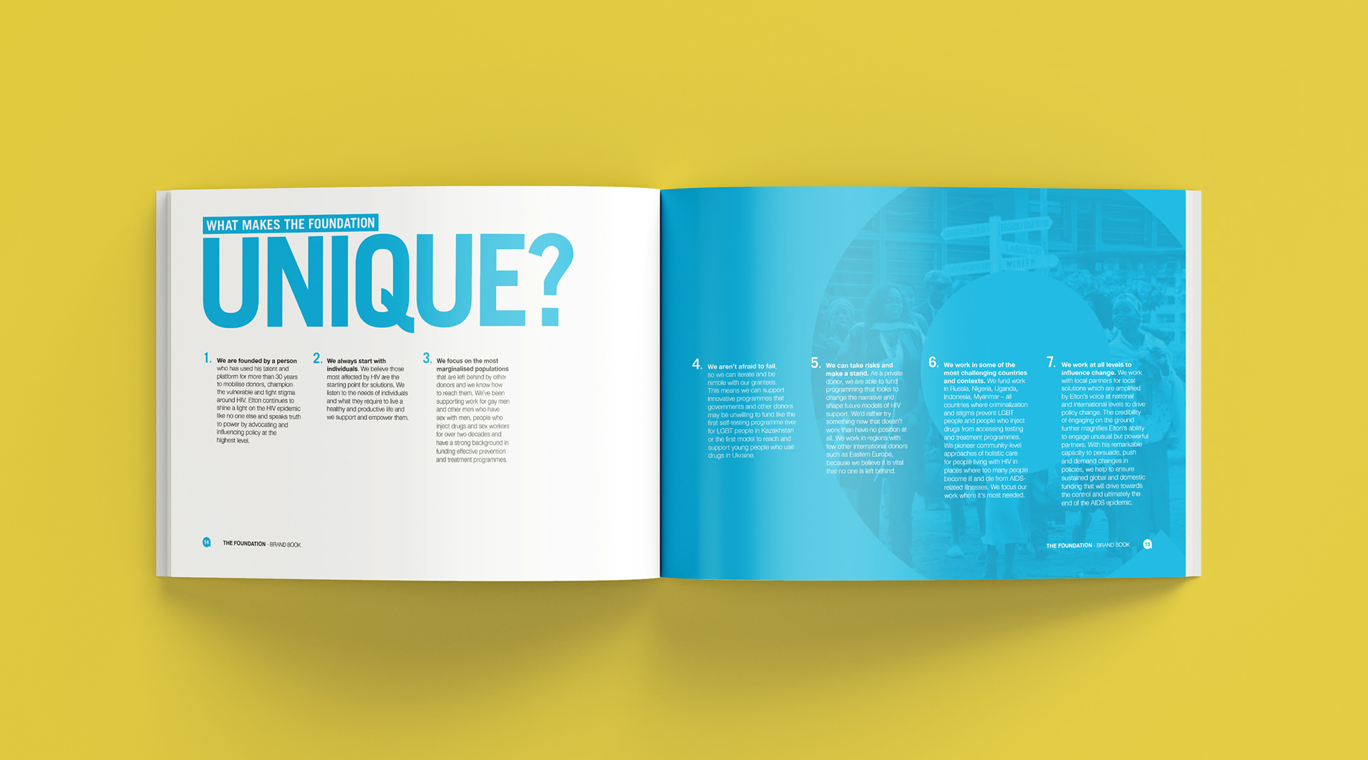
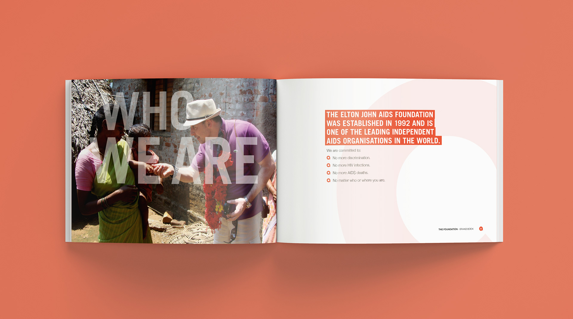
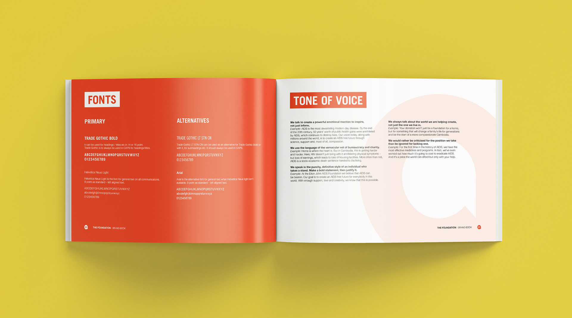
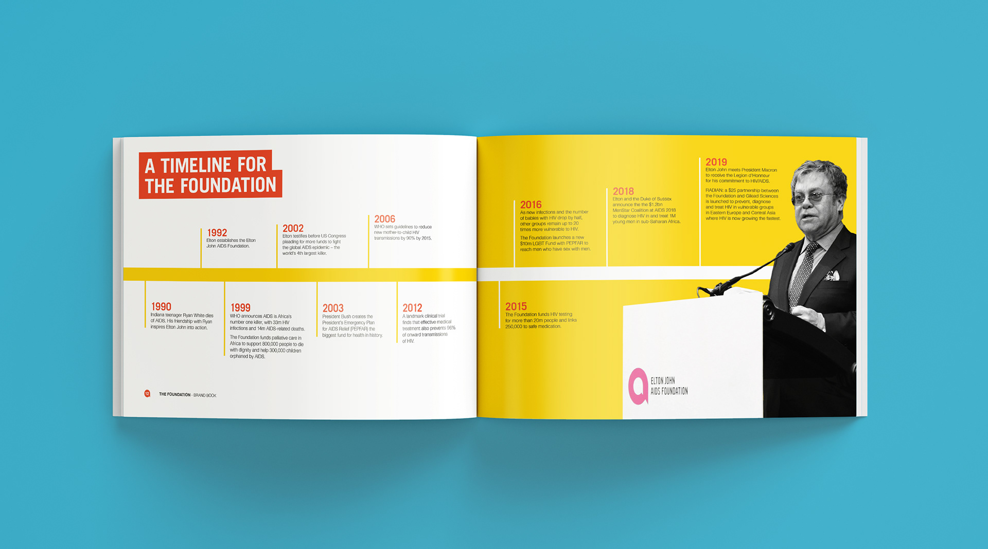
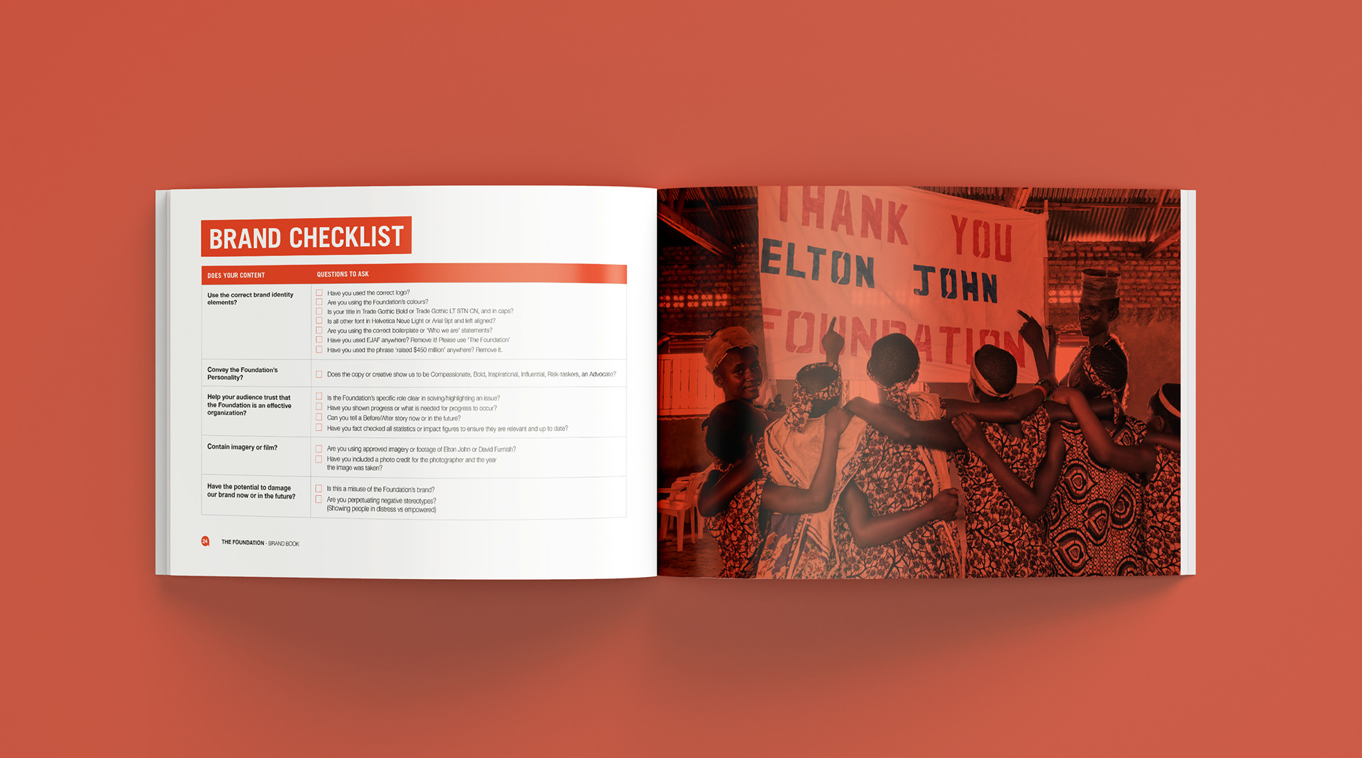
Focused on bold colour and confident typography, showing how the logo could be used as a graphic device throughout. The brand book outlined clear, practical guidance on logo use, colour, type and layout, ensuring visual consistency across all offices.
Outcome
A printed and digital brand book distributed to EJAF teams in London and New York, providing a clear framework for maintaining a cohesive and recognisable global identity.
Thank you for your time.
If you want to connect head over to the contact page and drop me a message.